

 Let’s begin by looking at EVERYTHING
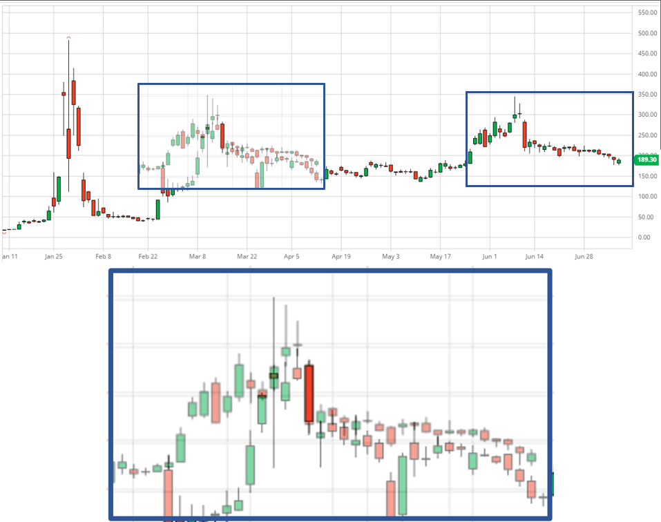
Here is a quick overlay of March / April data and June / July data to see how the trends are exactly the fucking same.
If we were to adjust the size of the red dildos so they match, you can fucking see the relative rates of change are EXACTLY THE FUCKING SAME again.
Here are the candlesticks directly on top of each other if I haven’t stressed my point enough.
Selecting which values to compare
Stretching the 6/15 red dildo to match the same length as 3/10, the close and high have the same ratio size. This is circled in rotten banana color.
Thus, it looks like we can compare the wick and the upper body of the candlesticks against each other.
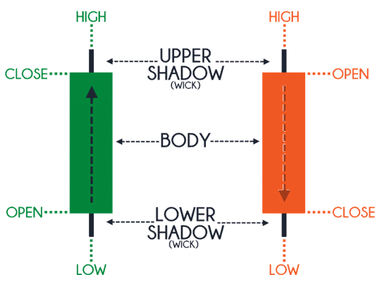
BUT FIRST
Let’s refresh our memory on how candlesticks work. Both the red and green have the same locations for their highs and lows, however, their open and close are different:
Back to the Mathemagics
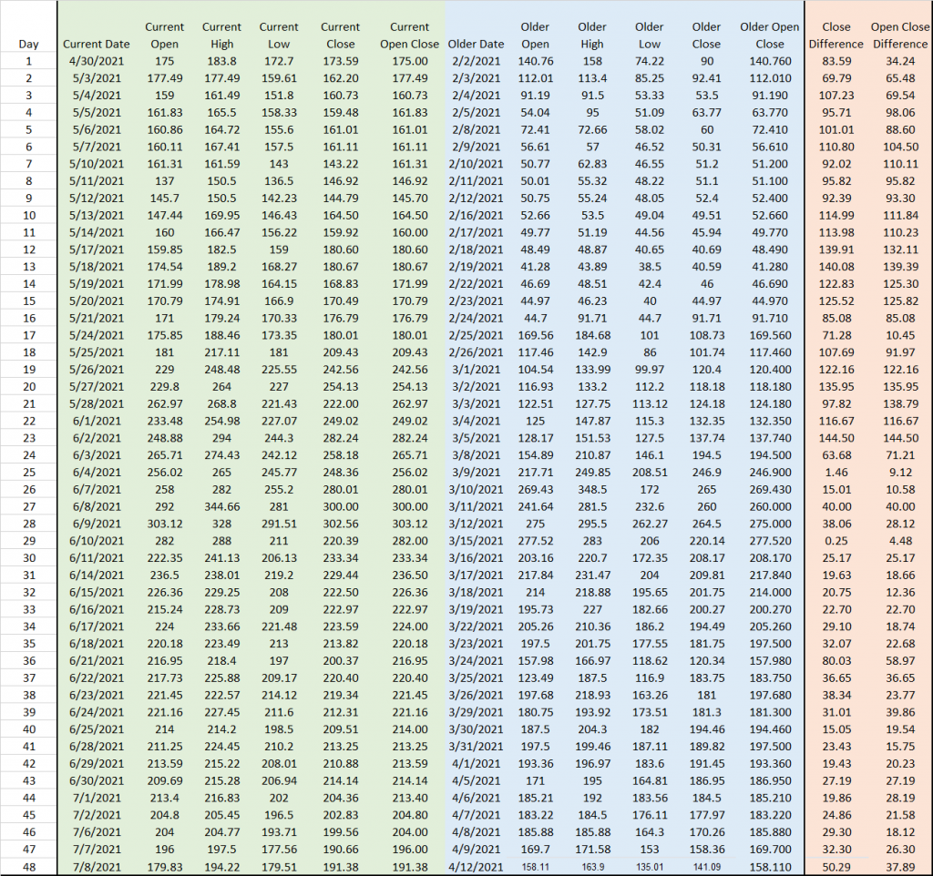
If we were to continue to match up 3/10 with 6/15, we get the below table. The “Current Open Close” and the “Older Open Close” is the value of the top of the candlestick body. The “Open Close Difference” is “Current Open Close” subtracted by “Older Open Close.”
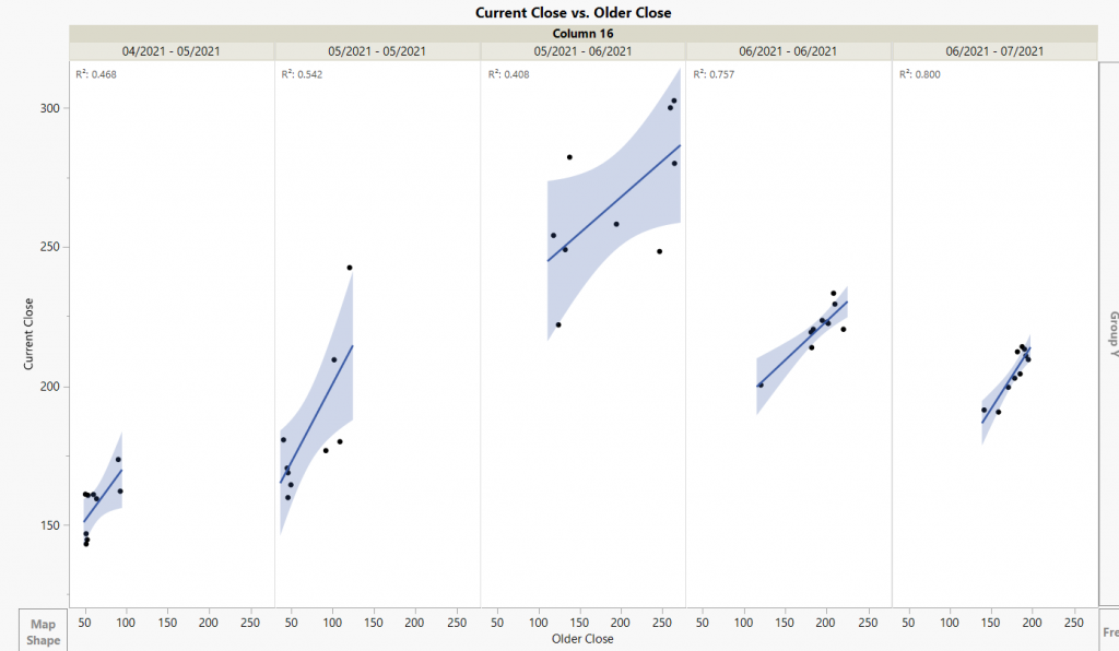
Looking at all the data at once
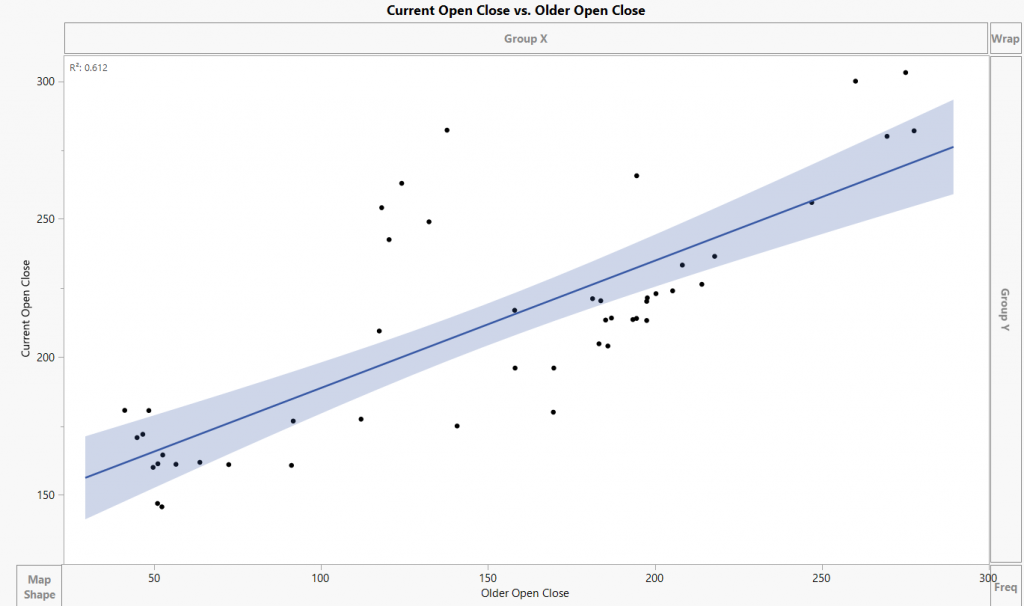
If we were to graph all the current open close against the older open close, the correlation isn’t that high.
However, if we separate into time intervals, we can see how the correlation increases and the similarities are beginning are becoming tighter and tighter. Our R^2 values are crazy good.
Looking at the difference between the Two
Despite if the day is red or green, the top parts of the candlestick body are trending similarly to each other. The average difference between the tops from the current data and the older data seems to be about $25.
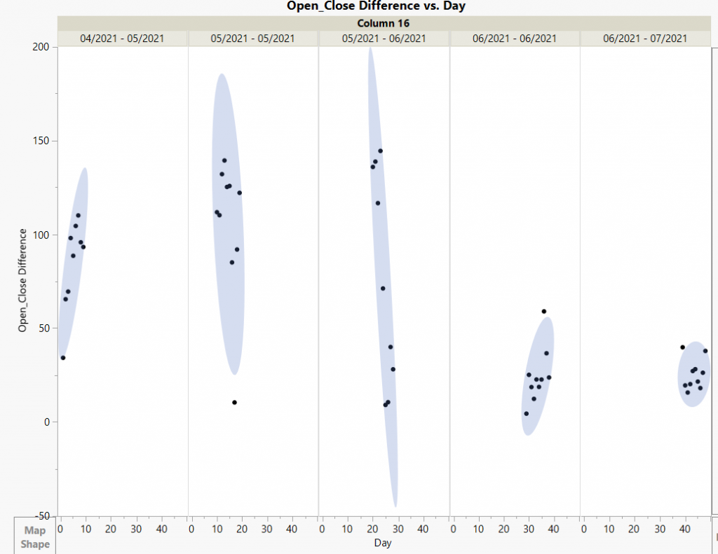
If we look at the difference by a day to day difference we can see it is beginning to level.
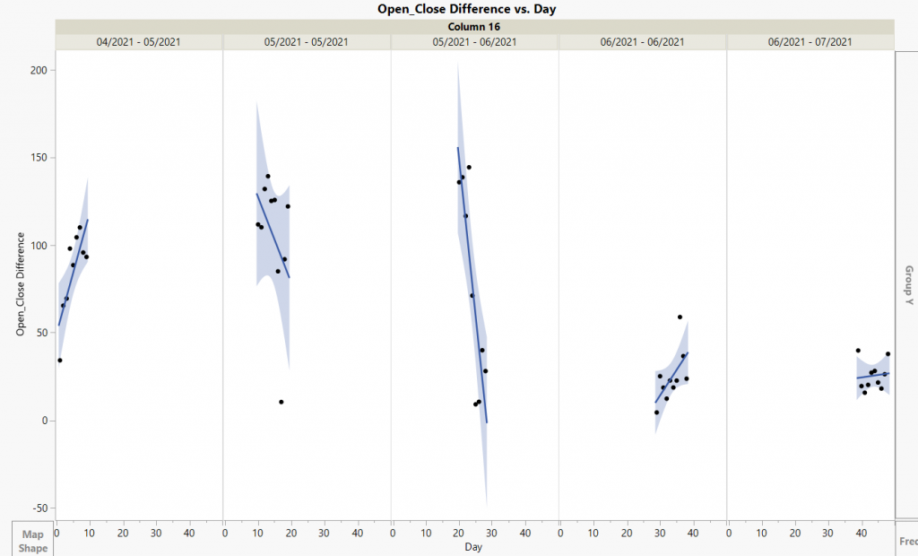
If we were to segregate the data into time intervals, we can see how the difference is moving to about $20 – $30. The regression lines are becoming more and more horizontal since as time continues, there is no change.
We can also view it as a density chart.
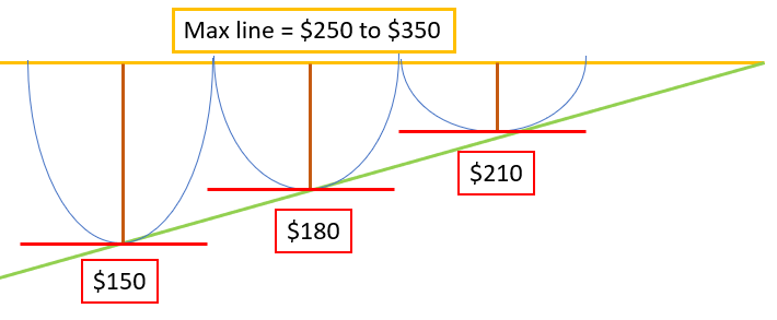
Incorporating the Algorithms
90 day calibration?
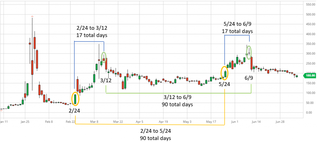
The red giant dildos we aligned earlier (3/10 and 6/15) have total of 68 trading days / 96 total between. If we take a few steps back, we can see how there is a break from the trends at 2/24 and 5/24 (circled in yellow). After the yellow circle dates, we see an upwards trend for about 17 days followed by an immediate drop.
The algorithms are repeating every 90 days. Left side buildup see the last max 16 days in followed by a small red day on day 17. The subsequent small red day is followed by a big red day.
TL;DR
The algorithms are repeating every 90 days with a 16 day positive buildup. The overall daily trends are also repeating itself. Hold the line
Thoughts
While each individual day share price is determined by the retail buying pressure, the overall trend is determined by the algorithms. The algorithms are so fucking influential that TA hasn’t matter this entire time no matter what the indicators. I think the algorithm looks something like this
I don’t think the share offerings had really any effect on the trends. I would assume this is because the MASSIVE amount of naked shorts in comparison.
Edit 1: fixed some typos
Edit 2: Added some more thoughts
Edit 3: GME Data
Edit 4:
Holy shit! I didn’t even know RC posted this. It even shows the same oscillations! Observational bias confirmed.
Edit 5: More thoughts
If we continue this ~$25 or $30 increase, we’ll soon have a $210 resistance. The following oscillation ($240) would cause the resistance to become the max and then moon. Just like in RC’s tweet.